Redesign In 20 Minutes (7) – Betfair’s Sign Up Form
Aug 11, 2009
This week’s redesign is looking at one of the first things a potential player needs to do before they can become a player on your gaming portal, this is the registration process.
A potential player just want to get started as fast as possible and therefor the registration process needs to be fast, easy and help the player in case he gets confused during the process.
Many gaming portals doesn’t put that much effort in making a great registration form and this week I’ve looked at Betfair’s sign up form and come up with a redesign with a few minor modifications to the existing one.
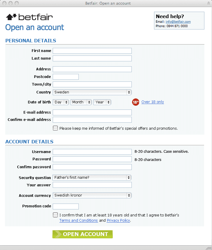
Today Betfair’s sign up form is very large, the height is 1320 pixels (on my mac) and it is looks very intimidating at first. My suggestion’s height is 850 pixels, 470 pixels less.

Image 1. Betfair’s sign up form today.
As you can see Betfair has divided the form into three parts, ”Personal details”, ”Address” and ”Betfair account details”. In my suggestion I’ve moved the address section up under ”Personal details”.
Here is a list of things I’ve done to the form to make it clearer and more straight forward to fill out.
Increased the font size
Made the input fields the same sizes to make it easier on the eye.
Changed the order of the fields
Removed County field: a function for finding out the county could be built insted.
Made a bigger submit button
Changed ”Do you have a Promotion ”Refer and Earn” code?” into a input field saving one click for the player.

Image 2. My 20 minute redesign suggestion for Betfair.
I Believe that these minor changes will help both Betfair and the players to faster and easier become players and Betfair.com.
Other things Betfair should consider is adding a ”Live support” insted of the e-mail support link. How many players want to wait for an e-mail answer before they continue to register?
/Staffan